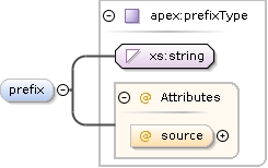
Defines a prefix for the filenames of mediafiles used in the screens below. The prefix is concatenatedin the front of the filenames given below before trying toopen any file.
<xs:element name="prefix" type="apex:prefixType" minOccurs="0" maxOccurs="1"><xs:annotation><xs:documentation>Defines a prefix for the filenames of media files used in the screens below. The prefix is concatenated in the front of the filenames given below before trying to open any file.</xs:documentation></xs:annotation></xs:element>
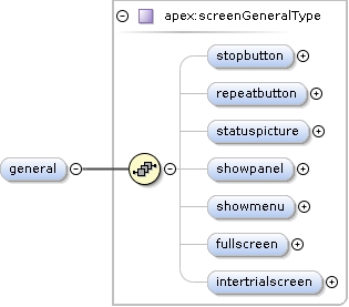
<xs:element name="general" type="apex:screenGeneralType" minOccurs="0"><xs:annotation><xs:documentation>Some general properties of the entire Apex window are set in this section. They are applied for each particular screen defined below.</xs:documentation></xs:annotation></xs:element>
Show a red panic button that immediately stops all output whenclicked.
Diagram
Type
xs:boolean
Properties
content
simple
minOccurs
0
Source
<xs:element name="stopbutton" type="xs:boolean" minOccurs="0"><xs:annotation><xs:documentation>Show a red panic button that immediately stops all output when clicked.</xs:documentation></xs:annotation></xs:element>
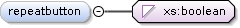
Show a repeat button that will repeat the last stimulus.
Diagram
Type
xs:boolean
Properties
content
simple
minOccurs
0
Source
<xs:element name="repeatbutton" type="xs:boolean" minOccurs="0"><xs:annotation><xs:documentation>Show a repeat button that will repeat the last stimulus.</xs:documentation></xs:annotation></xs:element>
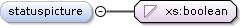
Show a status picture that indicates whether the user should be listening or giving an answer
Diagram
Type
xs:boolean
Properties
content
simple
minOccurs
0
Source
<xs:element name="statuspicture" type="xs:boolean" minOccurs="0"><xs:annotation><xs:documentation>Show a status picture that indicates whether the user should be listening or giving an answer</xs:documentation></xs:annotation></xs:element>
Show the panel; in case of childmode: a movie if defined
Diagram
Type
xs:boolean
Properties
content
simple
minOccurs
0
Source
<xs:element name="showpanel" type="xs:boolean" minOccurs="0"><xs:annotation><xs:documentation>Show the panel; in case of childmode: a movie if defined</xs:documentation></xs:annotation></xs:element>
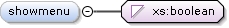
Determined whether the apex main menu (containing File, Calibration, etc.) is shown
Diagram
Type
xs:boolean
Properties
content
simple
minOccurs
0
default
true
Source
<xs:element name="showmenu" type="xs:boolean" minOccurs="0" default="true"><xs:annotation><xs:documentation>Determined whether the apex main menu (containing File, Calibration, etc.) is shown</xs:documentation></xs:annotation></xs:element>
If true, the main apex window will be shown full-screen, without window title or taskbar or whatever
Diagram
Type
xs:boolean
Properties
content
simple
minOccurs
0
default
false
Source
<xs:element name="fullscreen" type="xs:boolean" minOccurs="0" default="false"><xs:annotation><xs:documentation>If true, the main apex window will be shown full-screen, without window title or taskbar or whatever</xs:documentation></xs:annotation></xs:element>
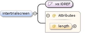
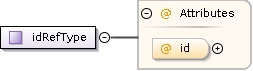
<xs:element name="intertrialscreen" minOccurs="0" maxOccurs="1"><xs:annotation><xs:documentation>A screen to show in between trials (after feedback that is)</xs:documentation></xs:annotation><xs:complexType><xs:simpleContent><xs:extension base="xs:IDREF"><xs:attribute name="length" type="xs:positiveInteger"><xs:annotation><xs:documentation>The period to show the screen</xs:documentation></xs:annotation></xs:attribute></xs:extension></xs:simpleContent></xs:complexType></xs:element>
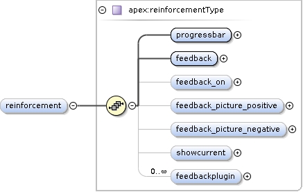
<xs:element name="reinforcement" type="apex:reinforcementType" minOccurs="0"><xs:annotation><xs:documentation>Defines what kind of feedback about the procedure and correctness of answers is shown to the user. This is valid for the whole experiment.</xs:documentation></xs:annotation></xs:element>
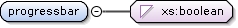
Show a progress bar in the right hand panel, indicating theexperiment progress. Not functional for multiprocedure ortrainingprocedure.
Diagram
Type
xs:boolean
Properties
content
simple
Source
<xs:element name="progressbar" type="xs:boolean"><xs:annotation><xs:documentation>Show a progress bar in the right hand panel, indicating the experiment progress. Not functional for multiprocedure or trainingprocedure.</xs:documentation></xs:annotation></xs:element>
Show visual feedback according to the correctness of the lastanswer. Feedback is shown using an upward or downward pointing thumb in theright hand panel.
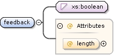
Length of the feedback in ms. If feedback is false but a length is present, the specified time will be the time between two trials.
Source
<xs:element name="feedback"><xs:annotation><xs:documentation>Show visual feedback according to the correctness of the last answer. Feedback is shown using an upward or downward pointing thumb in the right hand panel.</xs:documentation></xs:annotation><xs:complexType><xs:simpleContent><xs:extension base="xs:boolean"><xs:attribute name="length" type="xs:nonNegativeInteger" default="1000"><xs:annotation><xs:documentation>Length of the feedback in ms. If feedback is false but a length is present, the specified time will be the time between two trials.</xs:documentation></xs:annotation></xs:attribute></xs:extension></xs:simpleContent></xs:complexType></xs:element>
If feedback is shown, it is shown as a picture in the panel, but a screen element can also be highlighted.
Diagram
Type
restriction of xs:string
Properties
content
simple
minOccurs
0
default
correct
Facets
enumeration
none
Do not highlight any screenelement
enumeration
correct
Highlight the correct screenelement
enumeration
clicked
Highlight the clicked screenelement (the subject answer)
Source
<xs:element name="feedback_on" minOccurs="0" default="correct"><xs:annotation><xs:documentation>If feedback is shown, it is shown as a picture in the panel, but a screen element can also be highlighted.</xs:documentation></xs:annotation><xs:simpleType><xs:restriction base="xs:string"><xs:enumeration value="none"><xs:annotation><xs:documentation>Do not highlight any screenelement</xs:documentation></xs:annotation></xs:enumeration><xs:enumeration value="correct"><xs:annotation><xs:documentation>Highlight the correct screenelement</xs:documentation></xs:annotation></xs:enumeration><xs:enumeration value="clicked"><xs:annotation><xs:documentation>Highlight the clicked screenelement (the subject answer)</xs:documentation></xs:annotation></xs:enumeration></xs:restriction></xs:simpleType></xs:element>
Picture to be shown in the panel on positive feedback.
Diagram
Type
xs:string
Properties
content
simple
minOccurs
0
Source
<xs:element name="feedback_picture_positive" type="xs:string" minOccurs="0"><xs:annotation><xs:documentation>Picture to be shown in the panel on positive feedback.</xs:documentation></xs:annotation></xs:element>
Picture to be shown in the panel on negateive feedback.
Diagram
Type
xs:string
Properties
content
simple
minOccurs
0
Source
<xs:element name="feedback_picture_negative" type="xs:string" minOccurs="0"><xs:annotation><xs:documentation>Picture to be shown in the panel on negateive feedback.</xs:documentation></xs:annotation></xs:element>
Show a border around the screen element corresponding to thecurrently playing stimulus.
Diagram
Type
xs:boolean
Properties
content
simple
minOccurs
0
Source
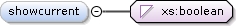
<xs:element name="showcurrent" type="xs:boolean" minOccurs="0"><xs:annotation><xs:documentation>Show a border around the screen element corresponding to the currently playing stimulus.</xs:documentation></xs:annotation></xs:element>
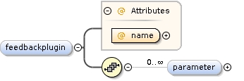
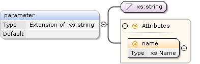
<xs:element name="feedbackplugin" minOccurs="0" maxOccurs="unbounded"><xs:annotation><xs:documentation></xs:documentation></xs:annotation><xs:complexType><xs:sequence><xs:element name="parameter" default="" minOccurs="0" maxOccurs="unbounded"><xs:annotation><xs:documentation>Parameter to be passed to the plugin</xs:documentation></xs:annotation><xs:complexType><xs:simpleContent><xs:extension base="xs:string"><xs:attribute name="name" type="xs:Name" use="required"/></xs:extension></xs:simpleContent></xs:complexType></xs:element></xs:sequence><xs:attribute name="name" type="xs:string" use="required"><xs:annotation><xs:documentation>Name of the plugin to be loaded</xs:documentation></xs:annotation></xs:attribute></xs:complexType></xs:element>
<xs:element name="parameter" default="" minOccurs="0" maxOccurs="unbounded"><xs:annotation><xs:documentation>Parameter to be passed to the plugin</xs:documentation></xs:annotation><xs:complexType><xs:simpleContent><xs:extension base="xs:string"><xs:attribute name="name" type="xs:Name" use="required"/></xs:extension></xs:simpleContent></xs:complexType></xs:element>
<xs:element name="style_apex" type="apex:stylesheetType" minOccurs="0"><xs:annotation><xs:documentation>Style that is to be applied to the whole of apex</xs:documentation></xs:annotation></xs:element>
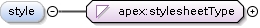
<xs:element name="style" type="apex:stylesheetType" minOccurs="0"><xs:annotation><xs:documentation>Style that is to be applied to all screens</xs:documentation></xs:annotation></xs:element>
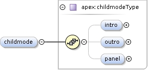
<xs:element name="childmode" type="apex:childmodeType" minOccurs="0"><xs:annotation><xs:documentation>Defines the elements used in child mode.</xs:documentation></xs:annotation></xs:element>
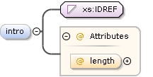
Length of the movie in ms, if not specified, the system will wait for the movie to end and then continue.
Source
<xs:element name="intro" minOccurs="0" maxOccurs="1"><xs:annotation><xs:documentation>The screen to show as intro before the experiment starts</xs:documentation></xs:annotation><xs:complexType><xs:simpleContent><xs:extension base="xs:IDREF"><xs:attribute name="length" type="xs:nonNegativeInteger"><xs:annotation><xs:documentation>Length of the movie in ms, if not specified, the system will wait for the movie to end and then continue.</xs:documentation></xs:annotation></xs:attribute></xs:extension></xs:simpleContent></xs:complexType></xs:element>
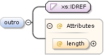
<xs:element name="outro" minOccurs="0" maxOccurs="1"><xs:annotation><xs:documentation>The screen to show as outro after the experiment has finished</xs:documentation></xs:annotation><xs:complexType><xs:simpleContent><xs:extension base="xs:IDREF"><xs:attribute name="length" type="xs:nonNegativeInteger"><xs:annotation><xs:documentation>Length of the movie in ms</xs:documentation></xs:annotation></xs:attribute></xs:extension></xs:simpleContent></xs:complexType></xs:element>
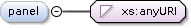
<xs:element name="panel" type="xs:anyURI" minOccurs="0" maxOccurs="1"><xs:annotation><xs:documentation>The panel reinforcement movie to use</xs:documentation></xs:annotation></xs:element>
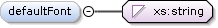
Name of the default font to be used for allelements of every screen. Possible names: any font found byQFontDialog
Diagram
Type
xs:string
Properties
content
simple
minOccurs
0
maxOccurs
1
Source
<xs:element name="defaultFont" type="xs:string" minOccurs="0" maxOccurs="1"><xs:annotation><xs:documentation>Name of the default font to be used for all elements of every screen. Possible names: any font found by QFontDialog</xs:documentation></xs:annotation></xs:element>
Size of the default font to be used for allelements of every screen. Unit: points as defined by thesystem
Diagram
Type
xs:positiveInteger
Properties
content
simple
minOccurs
0
maxOccurs
1
Source
<xs:element name="defaultFontsize" type="xs:positiveInteger" minOccurs="0" maxOccurs="1"><xs:annotation><xs:documentation>Size of the default font to be used for all elements of every screen. Unit: points as defined by the system</xs:documentation></xs:annotation></xs:element>
<xs:element name="screen" type="apex:screenType" minOccurs="0" maxOccurs="unbounded"><xs:annotation><xs:documentation>Every single screen defines a screen with a certain ID to be used elsewhere in the experiment file.</xs:documentation></xs:annotation><!-- As the following does not work, it it implemented per layout
--><!--xs:unique name="screenIDs">
<xs:selector xpath="./*[not(name()='buttongroup')]//*"></xs:selector>
<xs:field xpath="@id"></xs:field>
</xs:unique--></xs:element>
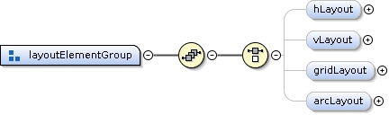
<xs:element name="hLayout" type="apex:hScreenLayoutType" minOccurs="0"><xs:annotation><xs:documentation>Horizontal layout: places elements next to each other</xs:documentation></xs:annotation><xs:unique name="screenId_hLayout"><xs:selector xpath="./*"/><xs:field xpath="@id"/></xs:unique></xs:element>
<xs:element name="font" type="xs:string" minOccurs="0"><xs:annotation><xs:documentation>TODO: how is the font specified?</xs:documentation></xs:annotation></xs:element>
Text font size, in points as defined by the system
Diagram
Type
xs:positiveInteger
Properties
content
simple
minOccurs
0
maxOccurs
1
Source
<xs:element name="fontsize" type="xs:positiveInteger" minOccurs="0" maxOccurs="1"><xs:annotation><xs:documentation>Text font size, in points as defined by the system</xs:documentation></xs:annotation></xs:element>
Put the element in it's own window instead of embedding it in the current layout
Diagram
Type
xs:boolean
Properties
content
simple
minOccurs
0
Source
<xs:element name="floating" type="xs:boolean" minOccurs="0"><xs:annotation><xs:documentation>Put the element in it's own window instead of embedding it in the current layout</xs:documentation></xs:annotation></xs:element>
If set to true, the element will always be disabled (can be used to "guide the eye")
Diagram
Type
xs:boolean
Properties
content
simple
minOccurs
0
Source
<xs:element name="disabled" type="xs:boolean" minOccurs="0"><xs:annotation><xs:documentation>If set to true, the element will always be disabled (can be used to "guide the eye")</xs:documentation></xs:annotation></xs:element>
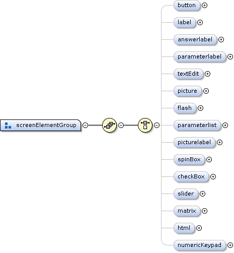
<xs:element name="text" type="xs:string"><xs:annotation><xs:documentation>Text to be printed on the button</xs:documentation></xs:annotation></xs:element>
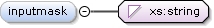
Input mask to restrict what can be typed in the textbox.Defined in the Qt documentation. If inputmask=="numbers", only numeric inputwill be allowed. If inputmask starts with a / (slash), the remainder will be used as a regular expression for QRegExpValidator.
Diagram
Type
xs:string
Properties
content
simple
minOccurs
0
maxOccurs
1
Source
<xs:element name="inputmask" type="xs:string" minOccurs="0" maxOccurs="1"><xs:annotation><xs:documentation>Input mask to restrict what can be typed in the textbox. Defined in the Qt documentation. If inputmask=="numbers", only numeric input will be allowed. If inputmask starts with a / (slash), the remainder will be used as a regular expression for QRegExpValidator.</xs:documentation></xs:annotation></xs:element>
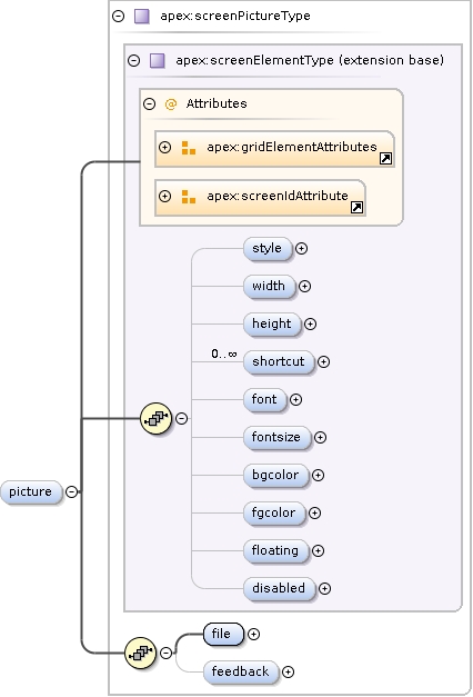
Filename of the picture. The format can be any of: PNG, BMP,XBM, XPM, JPEG, MNG, GIF, PBM (P1 or P4), PGM (P2 or P5), and PPM (P3 orP6). If path is relative, it will be prefixed with the prefix givenabove.
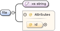
<xs:element name="file"><xs:annotation><xs:documentation>Filename of the picture. The format can be any of: PNG, BMP, XBM, XPM, JPEG, MNG, GIF, PBM (P1 or P4), PGM (P2 or P5), and PPM (P3 or P6). If path is relative, it will be prefixed with the prefix given above.</xs:documentation></xs:annotation><xs:complexType><xs:simpleContent><xs:extension base="xs:string"><xs:attribute name="id" type="xs:ID"/></xs:extension></xs:simpleContent></xs:complexType></xs:element>
<xs:element name="feedback" type="apex:feedbackPathsType" minOccurs="0" maxOccurs="1"><xs:annotation><xs:documentation>If used, overrides the normal feedback (using coloured borders) by drawing a different picture on screen.</xs:documentation></xs:annotation></xs:element>
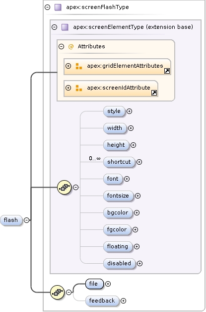
<xs:element name="file" type="xs:string"><xs:annotation><xs:documentation>Flash movie to be put on the screen.</xs:documentation></xs:annotation></xs:element>
<xs:element name="feedback" type="apex:feedbackPathsType" minOccurs="0" maxOccurs="1"><xs:annotation><xs:documentation>If used, overrides the normal feedback (using coloured borders) by putting a different movie on screen.</xs:documentation></xs:annotation></xs:element>
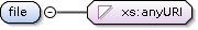
Filename of the picture. The format can be any of: PNG, BMP,XBM, XPM, JPEG, MNG, GIF, PBM (P1 or P4), PGM (P2 or P5), and PPM (P3 orP6). If path is relative, it will be prefixed with the prefix givenabove.
Diagram
Type
xs:anyURI
Properties
content
simple
Source
<xs:element name="file" type="xs:anyURI"><xs:annotation><xs:documentation>Filename of the picture. The format can be any of: PNG, BMP, XBM, XPM, JPEG, MNG, GIF, PBM (P1 or P4), PGM (P2 or P5), and PPM (P3 or P6). If path is relative, it will be prefixed with the prefix given above.</xs:documentation></xs:annotation></xs:element>
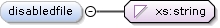
<xs:element name="disabledfile" type="xs:string" minOccurs="0"><xs:annotation><xs:documentation>Picture to be used if the element is disabled</xs:documentation></xs:annotation></xs:element>
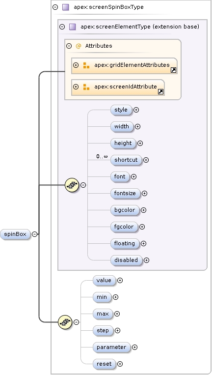
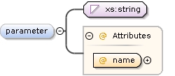
Parameter to be set to the value of the spinbox. This parameter will be set the NEXT trial.
Diagram
Type
xs:IDREF
Properties
content
simple
minOccurs
0
Source
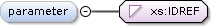
<xs:element name="parameter" type="xs:IDREF" minOccurs="0"><xs:annotation><xs:documentation>Parameter to be set to the value of the spinbox. This parameter will be set the NEXT trial.</xs:documentation></xs:annotation></xs:element>
<xs:element name="reset" type="xs:boolean" default="false" minOccurs="0"><xs:annotation><xs:documentation>Reset the value for every new trial</xs:documentation></xs:annotation></xs:element>
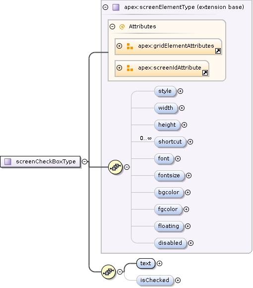
<xs:element name="text" type="xs:string"><xs:annotation><xs:documentation>Text to be printed right to the checkbox</xs:documentation></xs:annotation></xs:element>
<xs:element name="isChecked" type="xs:integer" minOccurs="0"><xs:annotation><xs:documentation>Determines whether checkbox is checked by default</xs:documentation></xs:annotation></xs:element>
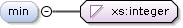
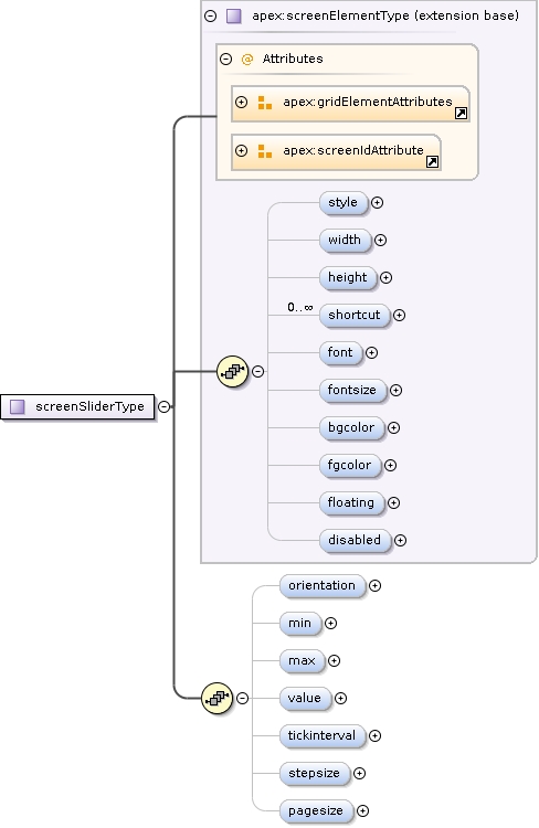
<xs:element name="min" type="xs:integer" minOccurs="0"><xs:annotation><xs:documentation>Minimum value of slider</xs:documentation></xs:annotation></xs:element>
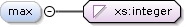
<xs:element name="max" type="xs:integer" minOccurs="0"><xs:annotation><xs:documentation>Maximum value of slider</xs:documentation></xs:annotation></xs:element>
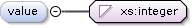
<xs:element name="value" type="xs:integer" minOccurs="0"><xs:annotation><xs:documentation>Default value of slider</xs:documentation></xs:annotation></xs:element>
<xs:element name="stepsize" type="xs:integer" minOccurs="0"><xs:annotation><xs:documentation>Step size on single arrow key press</xs:documentation></xs:annotation></xs:element>
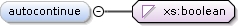
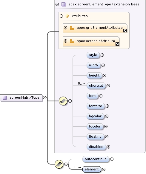
Automatically end the trial when all columns are completed
Diagram
Type
xs:boolean
Properties
content
simple
minOccurs
0
default
true
Source
<xs:element name="autocontinue" type="xs:boolean" default="true" minOccurs="0"><xs:annotation><xs:documentation>Automatically end the trial when all columns are completed</xs:documentation></xs:annotation></xs:element>
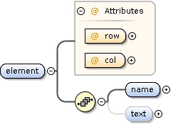
<xs:element name="element" minOccurs="1" maxOccurs="unbounded"><xs:complexType><xs:sequence><xs:element name="name" type="xs:string"><xs:annotation><xs:documentation>Name of the element. Will be reported in the results. Will also be used as text if no text is given.</xs:documentation></xs:annotation></xs:element><xs:element name="text" type="xs:string" minOccurs="0"><xs:annotation><xs:documentation>Text to be shown on the button</xs:documentation></xs:annotation></xs:element></xs:sequence><xs:attribute name="row" type="xs:positiveInteger" use="required"><xs:annotation><xs:documentation>Row in the matrix</xs:documentation></xs:annotation></xs:attribute><xs:attribute name="col" type="xs:positiveInteger" use="required"><xs:annotation><xs:documentation>Column in the matrix</xs:documentation></xs:annotation></xs:attribute></xs:complexType></xs:element>
Name of the element. Will be reported in the results. Will also be used as text if no text is given.
Diagram
Type
xs:string
Properties
content
simple
Source
<xs:element name="name" type="xs:string"><xs:annotation><xs:documentation>Name of the element. Will be reported in the results. Will also be used as text if no text is given.</xs:documentation></xs:annotation></xs:element>
<xs:element name="text" type="xs:string" minOccurs="0"><xs:annotation><xs:documentation>Text to be shown on the button</xs:documentation></xs:annotation></xs:element>
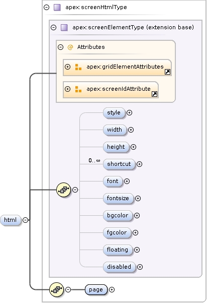
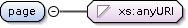
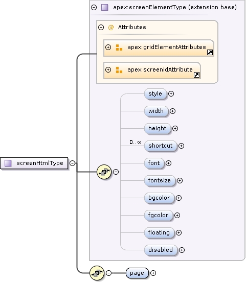
<xs:element name="page" type="xs:anyURI"><xs:annotation><xs:documentation>Filename of the HTML document.</xs:documentation></xs:annotation></xs:element>
Stretch factor for the columns: a list of integers separated by comma's. If specified, there should be as much
integers as columns. The width of the columns will be proportional to the numbers. E.g. if width=2 and columnstretch="1,2", the
second column will be twice as wide as the first. columnstretch="2,4" would have the same effect.
Stretch factor for the rows: a list of integers separated by comma's. If specified, there should be as much
integers as rows. The width of the rows will be proportional to the numbers. E.g. if height=3 and rowstretch="1,2,1", the
second row will be twice as wide as the first and thirs. rowstretch="2,4,2" would have the same effect.
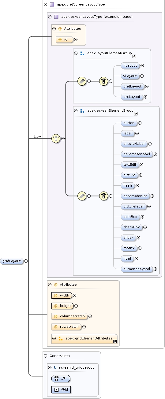
<xs:element name="gridLayout" type="apex:gridScreenLayoutType" minOccurs="0"><xs:annotation><xs:documentation>Gridlayout: places elements in an (irregular) grid.</xs:documentation></xs:annotation><xs:unique name="screenId_gridLayout"><xs:selector xpath="./*"/><xs:field xpath="@id"/></xs:unique></xs:element>
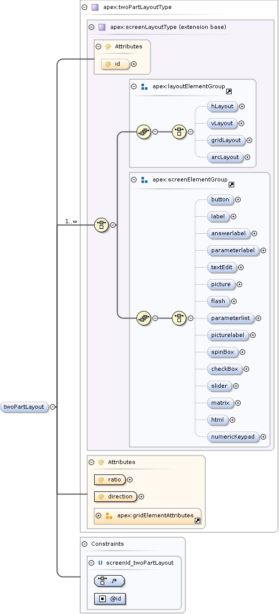
<xs:element name="twoPartLayout" type="apex:twoPartLayoutType" minOccurs="0"><xs:annotation><xs:documentation>Layout with a small upper part and larger lower part</xs:documentation></xs:annotation><xs:unique name="screenId_twoPartLayout"><xs:selector xpath="./*"/><xs:field xpath="@id"/></xs:unique></xs:element>
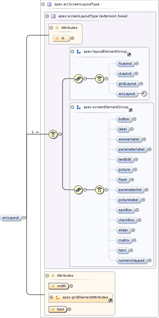
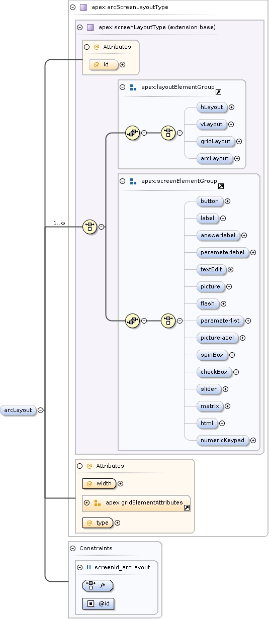
<xs:element name="arcLayout" type="apex:arcScreenLayoutType" minOccurs="0"><xs:annotation><xs:documentation>Arc layout: places elements in a semi-circle. Useful for localization experiments.</xs:documentation></xs:annotation><xs:unique name="screenId_arcLayout"><xs:selector xpath="./*"/><xs:field xpath="@id"/></xs:unique></xs:element>
Default element for getting the user input to send to thecorrector.
Diagram
Type
xs:Name
Properties
content
simple
minOccurs
0
maxOccurs
1
Source
<xs:element name="default_answer_element" type="xs:Name" minOccurs="0" maxOccurs="1"><xs:annotation><xs:documentation>Default element for getting the user input to send to the corrector.</xs:documentation></xs:annotation></xs:element>
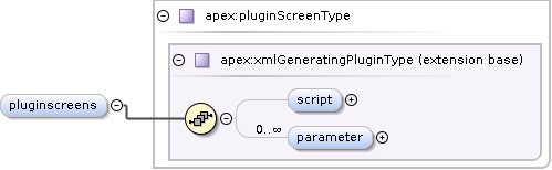
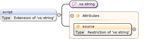
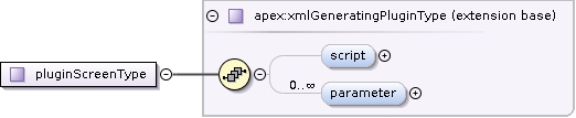
<xs:element name="script" minOccurs="0"><xs:complexType><xs:simpleContent><xs:extension base="xs:string"><xs:attribute name="source" use="required"><xs:simpleType><xs:annotation><xs:documentation>If inline, the ECMAScript function must be defined inside this element, if file, the filename must be given</xs:documentation></xs:annotation><xs:restriction base="xs:string"><xs:enumeration value="inline"/><xs:enumeration value="file"/></xs:restriction></xs:simpleType></xs:attribute></xs:extension></xs:simpleContent></xs:complexType></xs:element>
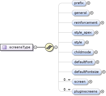
<xs:complexType name="screensType"><xs:sequence><xs:element name="prefix" type="apex:prefixType" minOccurs="0" maxOccurs="1"><xs:annotation><xs:documentation>Defines a prefix for the filenames of media files used in the screens below. The prefix is concatenated in the front of the filenames given below before trying to open any file.</xs:documentation></xs:annotation></xs:element><xs:element name="general" type="apex:screenGeneralType" minOccurs="0"><xs:annotation><xs:documentation>Some general properties of the entire Apex window are set in this section. They are applied for each particular screen defined below.</xs:documentation></xs:annotation></xs:element><xs:element name="reinforcement" type="apex:reinforcementType" minOccurs="0"><xs:annotation><xs:documentation>Defines what kind of feedback about the procedure and correctness of answers is shown to the user. This is valid for the whole experiment.</xs:documentation></xs:annotation></xs:element><xs:element name="style_apex" type="apex:stylesheetType" minOccurs="0"><xs:annotation><xs:documentation>Style that is to be applied to the whole of apex</xs:documentation></xs:annotation></xs:element><xs:element name="style" type="apex:stylesheetType" minOccurs="0"><xs:annotation><xs:documentation>Style that is to be applied to all screens</xs:documentation></xs:annotation></xs:element><xs:element name="childmode" type="apex:childmodeType" minOccurs="0"><xs:annotation><xs:documentation>Defines the elements used in child mode.</xs:documentation></xs:annotation></xs:element><xs:element name="defaultFont" type="xs:string" minOccurs="0" maxOccurs="1"><xs:annotation><xs:documentation>Name of the default font to be used for all elements of every screen. Possible names: any font found by QFontDialog</xs:documentation></xs:annotation></xs:element><xs:element name="defaultFontsize" type="xs:positiveInteger" minOccurs="0" maxOccurs="1"><xs:annotation><xs:documentation>Size of the default font to be used for all elements of every screen. Unit: points as defined by the system</xs:documentation></xs:annotation></xs:element><xs:element name="screen" type="apex:screenType" minOccurs="0" maxOccurs="unbounded"><xs:annotation><xs:documentation>Every single screen defines a screen with a certain ID to be used elsewhere in the experiment file.</xs:documentation></xs:annotation><!-- As the following does not work, it it implemented per layout
--><!--xs:unique name="screenIDs">
<xs:selector xpath="./*[not(name()='buttongroup')]//*"></xs:selector>
<xs:field xpath="@id"></xs:field>
</xs:unique--></xs:element><xs:element name="pluginscreens" type="apex:pluginScreenType" minOccurs="0" maxOccurs="unbounded"/></xs:sequence></xs:complexType>
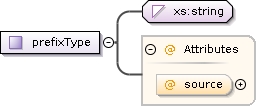
A prefix can be specified inline (ie: here) or by specifying the ID of a prefix in the main configfile. Example:Absolute: c:/program files/blaRelative: ../stimuli
<xs:complexType name="prefixType"><xs:annotation><xs:documentation>A prefix can be specified inline (ie: here) or by specifying the ID of a prefix in the main configfile. Example: Absolute: c:/program files/bla Relative: ../stimuli</xs:documentation></xs:annotation><xs:simpleContent><xs:extension base="xs:string"><xs:attribute name="source" default="inline"><xs:simpleType><xs:restriction base="xs:string"><xs:enumeration value="inline"><xs:annotation><xs:documentation>The prefix will be specified in this element</xs:documentation></xs:annotation></xs:enumeration><xs:enumeration value="apexconfig"><xs:annotation><xs:documentation>The prefix will be loaded from the apexconfig.xml file</xs:documentation></xs:annotation></xs:enumeration></xs:restriction></xs:simpleType></xs:attribute></xs:extension></xs:simpleContent></xs:complexType>
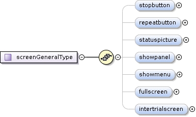
<xs:complexType name="screenGeneralType"><xs:sequence><xs:element name="stopbutton" type="xs:boolean" minOccurs="0"><xs:annotation><xs:documentation>Show a red panic button that immediately stops all output when clicked.</xs:documentation></xs:annotation></xs:element><xs:element name="repeatbutton" type="xs:boolean" minOccurs="0"><xs:annotation><xs:documentation>Show a repeat button that will repeat the last stimulus.</xs:documentation></xs:annotation></xs:element><xs:element name="statuspicture" type="xs:boolean" minOccurs="0"><xs:annotation><xs:documentation>Show a status picture that indicates whether the user should be listening or giving an answer</xs:documentation></xs:annotation></xs:element><xs:element name="showpanel" type="xs:boolean" minOccurs="0"><xs:annotation><xs:documentation>Show the panel; in case of childmode: a movie if defined</xs:documentation></xs:annotation></xs:element><xs:element name="showmenu" type="xs:boolean" minOccurs="0" default="true"><xs:annotation><xs:documentation>Determined whether the apex main menu (containing File, Calibration, etc.) is shown</xs:documentation></xs:annotation></xs:element><xs:element name="fullscreen" type="xs:boolean" minOccurs="0" default="false"><xs:annotation><xs:documentation>If true, the main apex window will be shown full-screen, without window title or taskbar or whatever</xs:documentation></xs:annotation></xs:element><xs:element name="intertrialscreen" minOccurs="0" maxOccurs="1"><xs:annotation><xs:documentation>A screen to show in between trials (after feedback that is)</xs:documentation></xs:annotation><xs:complexType><xs:simpleContent><xs:extension base="xs:IDREF"><xs:attribute name="length" type="xs:positiveInteger"><xs:annotation><xs:documentation>The period to show the screen</xs:documentation></xs:annotation></xs:attribute></xs:extension></xs:simpleContent></xs:complexType></xs:element></xs:sequence></xs:complexType>
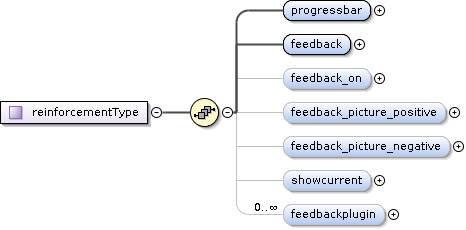
<xs:complexType name="reinforcementType"><xs:sequence><xs:element name="progressbar" type="xs:boolean"><xs:annotation><xs:documentation>Show a progress bar in the right hand panel, indicating the experiment progress. Not functional for multiprocedure or trainingprocedure.</xs:documentation></xs:annotation></xs:element><xs:element name="feedback"><xs:annotation><xs:documentation>Show visual feedback according to the correctness of the last answer. Feedback is shown using an upward or downward pointing thumb in the right hand panel.</xs:documentation></xs:annotation><xs:complexType><xs:simpleContent><xs:extension base="xs:boolean"><xs:attribute name="length" type="xs:nonNegativeInteger" default="1000"><xs:annotation><xs:documentation>Length of the feedback in ms. If feedback is false but a length is present, the specified time will be the time between two trials.</xs:documentation></xs:annotation></xs:attribute></xs:extension></xs:simpleContent></xs:complexType></xs:element><xs:element name="feedback_on" minOccurs="0" default="correct"><xs:annotation><xs:documentation>If feedback is shown, it is shown as a picture in the panel, but a screen element can also be highlighted.</xs:documentation></xs:annotation><xs:simpleType><xs:restriction base="xs:string"><xs:enumeration value="none"><xs:annotation><xs:documentation>Do not highlight any screenelement</xs:documentation></xs:annotation></xs:enumeration><xs:enumeration value="correct"><xs:annotation><xs:documentation>Highlight the correct screenelement</xs:documentation></xs:annotation></xs:enumeration><xs:enumeration value="clicked"><xs:annotation><xs:documentation>Highlight the clicked screenelement (the subject answer)</xs:documentation></xs:annotation></xs:enumeration></xs:restriction></xs:simpleType></xs:element><xs:element name="feedback_picture_positive" type="xs:string" minOccurs="0"><xs:annotation><xs:documentation>Picture to be shown in the panel on positive feedback.</xs:documentation></xs:annotation></xs:element><xs:element name="feedback_picture_negative" type="xs:string" minOccurs="0"><xs:annotation><xs:documentation>Picture to be shown in the panel on negateive feedback.</xs:documentation></xs:annotation></xs:element><xs:element name="showcurrent" type="xs:boolean" minOccurs="0"><xs:annotation><xs:documentation>Show a border around the screen element corresponding to the currently playing stimulus.</xs:documentation></xs:annotation></xs:element><xs:element name="feedbackplugin" minOccurs="0" maxOccurs="unbounded"><xs:annotation><xs:documentation></xs:documentation></xs:annotation><xs:complexType><xs:sequence><xs:element name="parameter" default="" minOccurs="0" maxOccurs="unbounded"><xs:annotation><xs:documentation>Parameter to be passed to the plugin</xs:documentation></xs:annotation><xs:complexType><xs:simpleContent><xs:extension base="xs:string"><xs:attribute name="name" type="xs:Name" use="required"/></xs:extension></xs:simpleContent></xs:complexType></xs:element></xs:sequence><xs:attribute name="name" type="xs:string" use="required"><xs:annotation><xs:documentation>Name of the plugin to be loaded</xs:documentation></xs:annotation></xs:attribute></xs:complexType></xs:element></xs:sequence></xs:complexType>
Any stylesheet supoprted by Qt (google for "qt style sheet")Warning: if you request changed not supported by the native style engine, we switch to the Qt style engine, possibly resulting in other changes in layout.
<xs:simpleType name="stylesheetType"><xs:annotation><xs:documentation>Any stylesheet supoprted by Qt (google for "qt style sheet") Warning: if you request changed not supported by the native style engine, we switch to the Qt style engine, possibly resulting in other changes in layout.</xs:documentation></xs:annotation><xs:restriction base="xs:string"/></xs:simpleType>
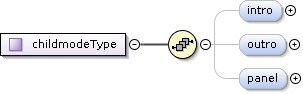
<xs:complexType name="childmodeType"><xs:sequence><xs:element name="intro" minOccurs="0" maxOccurs="1"><xs:annotation><xs:documentation>The screen to show as intro before the experiment starts</xs:documentation></xs:annotation><xs:complexType><xs:simpleContent><xs:extension base="xs:IDREF"><xs:attribute name="length" type="xs:nonNegativeInteger"><xs:annotation><xs:documentation>Length of the movie in ms, if not specified, the system will wait for the movie to end and then continue.</xs:documentation></xs:annotation></xs:attribute></xs:extension></xs:simpleContent></xs:complexType></xs:element><xs:element name="outro" minOccurs="0" maxOccurs="1"><xs:annotation><xs:documentation>The screen to show as outro after the experiment has finished</xs:documentation></xs:annotation><xs:complexType><xs:simpleContent><xs:extension base="xs:IDREF"><xs:attribute name="length" type="xs:nonNegativeInteger"><xs:annotation><xs:documentation>Length of the movie in ms</xs:documentation></xs:annotation></xs:attribute></xs:extension></xs:simpleContent></xs:complexType></xs:element><xs:element name="panel" type="xs:anyURI" minOccurs="0" maxOccurs="1"><xs:annotation><xs:documentation>The panel reinforcement movie to use</xs:documentation></xs:annotation></xs:element></xs:sequence></xs:complexType>
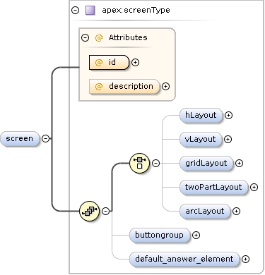
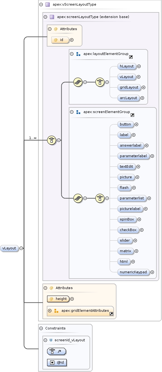
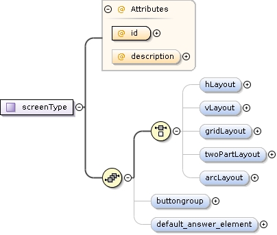
<xs:complexType name="screenType"><xs:sequence><xs:choice maxOccurs="1"><xs:element name="hLayout" type="apex:hScreenLayoutType" minOccurs="0"><xs:annotation><xs:documentation>Horizontal layout: places elements next to each other</xs:documentation></xs:annotation><xs:unique name="screenId_hLayout"><xs:selector xpath="./*"/><xs:field xpath="@id"/></xs:unique></xs:element><xs:element name="vLayout" type="apex:vScreenLayoutType" minOccurs="0"><xs:annotation><xs:documentation>Vertical layout: places elements above each other</xs:documentation></xs:annotation><xs:unique name="screenId_vLayout"><xs:selector xpath="./*"/><xs:field xpath="@id"/></xs:unique></xs:element><xs:element name="gridLayout" type="apex:gridScreenLayoutType" minOccurs="0"><xs:annotation><xs:documentation>Gridlayout: places elements in an (irregular) grid.</xs:documentation></xs:annotation><xs:unique name="screenId_gridLayout"><xs:selector xpath="./*"/><xs:field xpath="@id"/></xs:unique></xs:element><xs:element name="twoPartLayout" type="apex:twoPartLayoutType" minOccurs="0"><xs:annotation><xs:documentation>Layout with a small upper part and larger lower part</xs:documentation></xs:annotation><xs:unique name="screenId_twoPartLayout"><xs:selector xpath="./*"/><xs:field xpath="@id"/></xs:unique></xs:element><xs:element name="arcLayout" type="apex:arcScreenLayoutType" minOccurs="0"><xs:annotation><xs:documentation>Arc layout: places elements in a semi-circle. Useful for localization experiments.</xs:documentation></xs:annotation><xs:unique name="screenId_arcLayout"><xs:selector xpath="./*"/><xs:field xpath="@id"/></xs:unique></xs:element></xs:choice><xs:element name="buttongroup" type="apex:buttonGroupType" minOccurs="0" maxOccurs="1"/><xs:element name="default_answer_element" type="xs:Name" minOccurs="0" maxOccurs="1"><xs:annotation><xs:documentation>Default element for getting the user input to send to the corrector.</xs:documentation></xs:annotation></xs:element></xs:sequence><xs:attribute name="id" type="xs:ID" use="required"/><xs:attribute name="description" type="xs:string" use="optional"><xs:annotation><xs:documentation>Description of the screen - for your own reference</xs:documentation></xs:annotation></xs:attribute></xs:complexType>
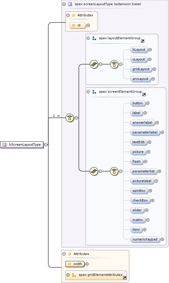
<xs:complexType name="hScreenLayoutType"><xs:annotation><xs:documentation>Horizontal layout: places elements next to each other</xs:documentation></xs:annotation><xs:complexContent><xs:extension base="apex:screenLayoutType"><xs:attribute name="width" type="xs:int" use="required"></xs:attribute><!--xs:attribute name="id" type="xs:Name" use="optional"></xs:attribute--><xs:attributeGroup ref="apex:gridElementAttributes"/></xs:extension></xs:complexContent></xs:complexType>
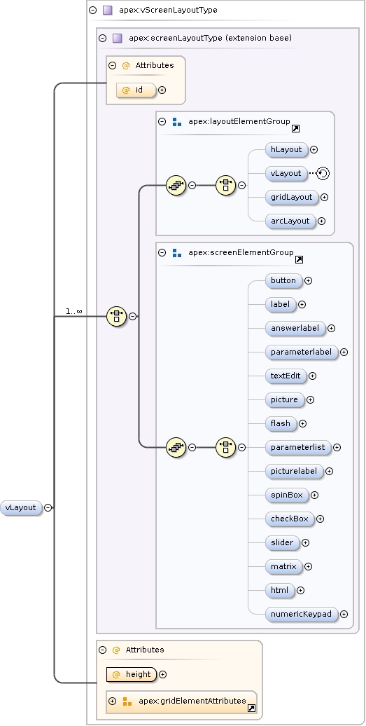
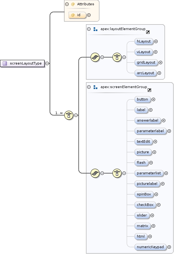
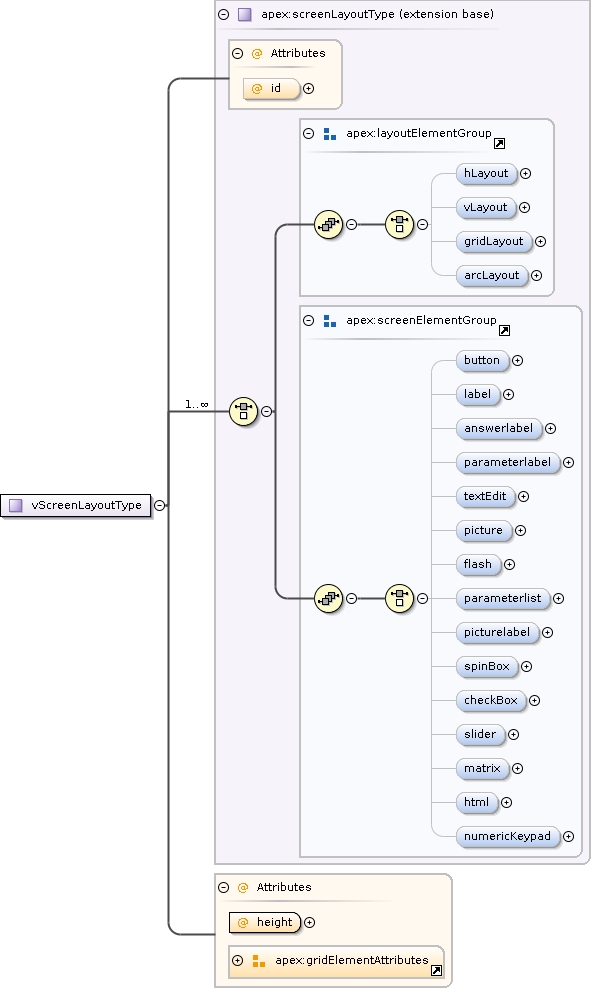
<xs:complexType name="screenLayoutType" abstract="true"><xs:annotation><xs:documentation>Base type for all layout types</xs:documentation></xs:annotation><xs:choice maxOccurs="unbounded"><xs:group ref="apex:layoutElementGroup"></xs:group><xs:group ref="apex:screenElementGroup"></xs:group></xs:choice><xs:attribute name="id" type="xs:Name" use="optional"/></xs:complexType>
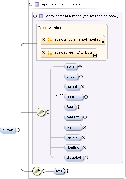
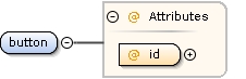
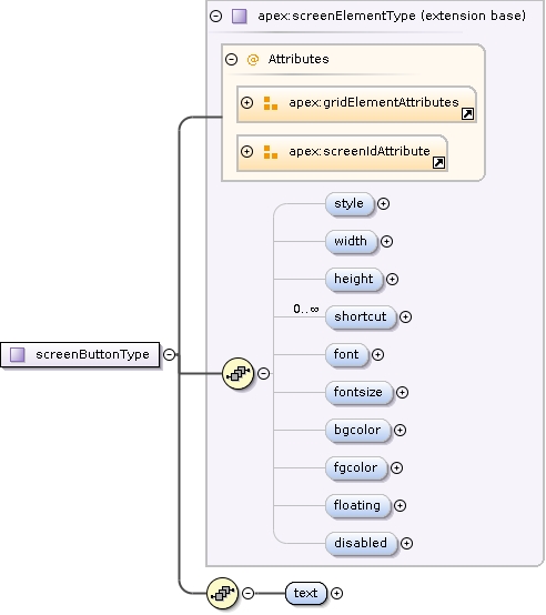
<xs:complexType name="screenButtonType"><xs:annotation><xs:documentation>Button element. Can be clicked. If button is clicked, the subject is assumed to have responded to the trial.</xs:documentation></xs:annotation><xs:complexContent><xs:extension base="apex:screenElementType"><xs:sequence><xs:element name="text" type="xs:string"><xs:annotation><xs:documentation>Text to be printed on the button</xs:documentation></xs:annotation></xs:element></xs:sequence></xs:extension></xs:complexContent></xs:complexType>
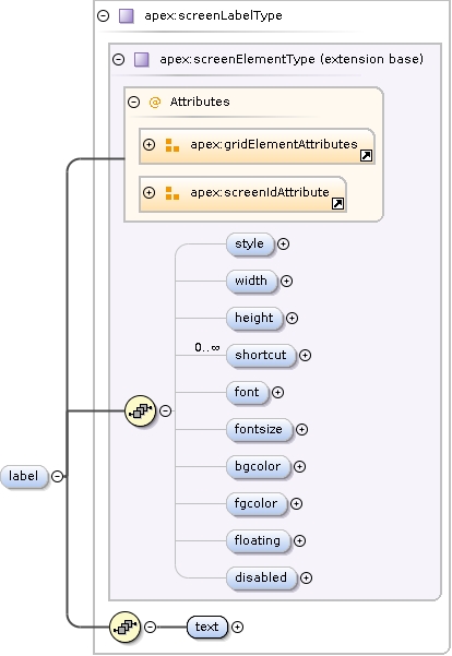
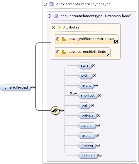
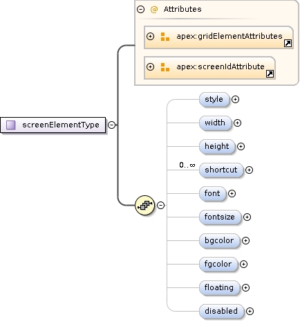
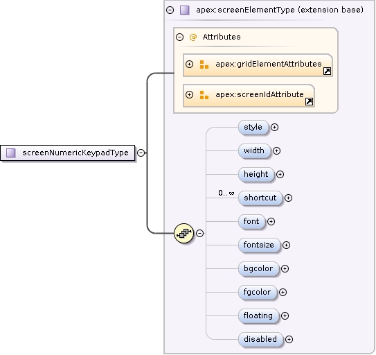
<xs:complexType name="screenElementType" abstract="true"><xs:annotation><xs:documentation>Base element for all screen elements</xs:documentation></xs:annotation><xs:sequence><xs:element name="style" type="apex:stylesheetType" minOccurs="0"/><xs:element name="width" type="xs:nonNegativeInteger" minOccurs="0"><xs:annotation><xs:documentation>TODO: units?</xs:documentation></xs:annotation></xs:element><xs:element name="height" type="xs:nonNegativeInteger" minOccurs="0"/><xs:element name="shortcut" type="apex:shortcutType" minOccurs="0" maxOccurs="unbounded"/><xs:element name="font" type="xs:string" minOccurs="0"><xs:annotation><xs:documentation>TODO: how is the font specified?</xs:documentation></xs:annotation></xs:element><xs:element name="fontsize" type="xs:positiveInteger" minOccurs="0" maxOccurs="1"><xs:annotation><xs:documentation>Text font size, in points as defined by the system</xs:documentation></xs:annotation></xs:element><xs:element name="bgcolor" type="apex:colorType" minOccurs="0"/><xs:element name="fgcolor" type="apex:colorType" minOccurs="0"/><xs:element name="floating" type="xs:boolean" minOccurs="0"><xs:annotation><xs:documentation>Put the element in it's own window instead of embedding it in the current layout</xs:documentation></xs:annotation></xs:element><xs:element name="disabled" type="xs:boolean" minOccurs="0"><xs:annotation><xs:documentation>If set to true, the element will always be disabled (can be used to "guide the eye")</xs:documentation></xs:annotation></xs:element></xs:sequence><xs:attributeGroup ref="apex:gridElementAttributes"/><xs:attributeGroup ref="apex:screenIdAttribute"/></xs:complexType>
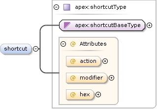
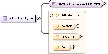
<xs:complexType name="shortcutType"><xs:annotation><xs:documentation>Defines a keyboard key combination to be used as a shortcut</xs:documentation></xs:annotation><xs:simpleContent><xs:extension base="apex:shortcutBaseType"><xs:attribute name="action" use="optional" default="click"><xs:simpleType><xs:restriction base="xs:string"><xs:enumeration value="click"><xs:annotation><xs:documentation>Has the same effect as clicking the widget</xs:documentation></xs:annotation></xs:enumeration><xs:enumeration value="up"><xs:annotation><xs:documentation>Has the same effect as clicking the up-button</xs:documentation></xs:annotation></xs:enumeration><xs:enumeration value="down"><xs:annotation><xs:documentation>Has the same effect as clicking the up-button</xs:documentation></xs:annotation></xs:enumeration></xs:restriction></xs:simpleType></xs:attribute><xs:attribute name="modifier"><xs:annotation><xs:documentation>Dead key to be used together with the shortcut</xs:documentation></xs:annotation><xs:simpleType><xs:restriction base="xs:string"><xs:enumeration value="Ctrl"/><xs:enumeration value="Alt"/><xs:enumeration value="Shift"/></xs:restriction></xs:simpleType></xs:attribute><xs:attribute name="hex" type="xs:boolean"><xs:annotation><xs:documentation>If true, parses the shortcut as a hexadecimal number. See the Key enum in qtnamespace.h for known values</xs:documentation></xs:annotation></xs:attribute></xs:extension></xs:simpleContent></xs:complexType>
Define a color as accepted by Qt colorstring, can be:* #RGB (each of R, G, and B is a single hex digit)* #RRGGBB* #RRRGGGBBB* #RRRRGGGGBBBB* a color name http://www.w3.org/TR/SVG/types.html#ColorKeywords* transparent
<xs:simpleType name="colorType"><xs:annotation><xs:documentation>Define a color as accepted by Qt colorstring, can be: * #RGB (each of R, G, and B is a single hex digit) * #RRGGBB * #RRRGGGBBB * #RRRRGGGGBBBB * a color name http://www.w3.org/TR/SVG/types.html#ColorKeywords * transparent</xs:documentation></xs:annotation><xs:restriction base="xs:string"/></xs:simpleType>
<xs:complexType name="screenLabelType"><xs:annotation><xs:documentation>Label element: simple text on the screen. Cannot be used for user input.</xs:documentation></xs:annotation><xs:complexContent><xs:extension base="apex:screenElementType"><xs:sequence><xs:element name="text" type="xs:string"/></xs:sequence></xs:extension></xs:complexContent></xs:complexType>
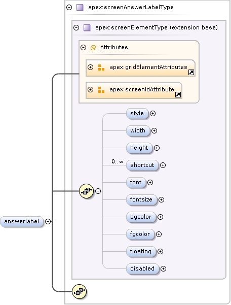
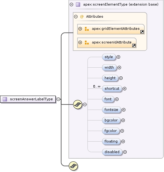
<xs:complexType name="screenAnswerLabelType"><xs:annotation><xs:documentation>Label containing the correct answer for the current trial.</xs:documentation></xs:annotation><xs:complexContent><xs:extension base="apex:screenElementType"><xs:sequence><!--xs:element name="fontsize" type="xs:positiveInteger" minOccurs="0" maxOccurs="1"/--></xs:sequence></xs:extension></xs:complexContent><!--xs:attributeGroup ref="apex:gridElementAttributes"/>
<xs:attributeGroup ref="apex:idAttribute"/--></xs:complexType>
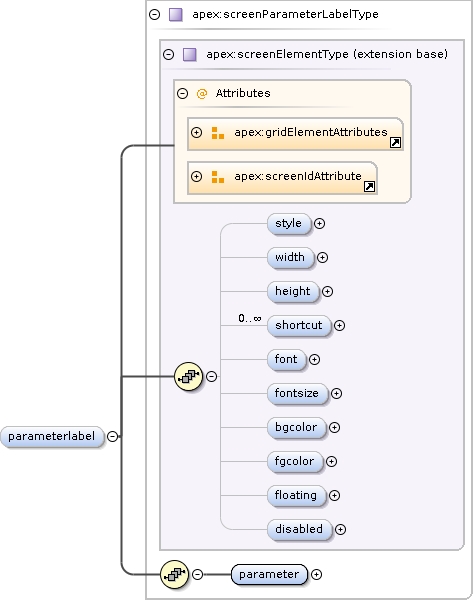
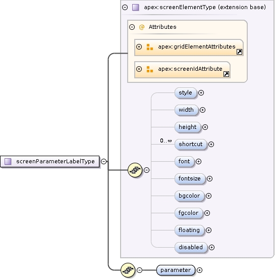
<xs:complexType name="screenParameterLabelType"><xs:annotation><xs:documentation>Label containing the value of a parameter.</xs:documentation></xs:annotation><xs:complexContent><xs:extension base="apex:screenElementType"><xs:sequence><!--xs:element name="fontsize" type="xs:positiveInteger" minOccurs="0" maxOccurs="1"/--><xs:element name="parameter" type="apex:showparameterType" minOccurs="1" maxOccurs="1"/></xs:sequence></xs:extension></xs:complexContent><!--xs:attributeGroup ref="apex:gridElementAttributes"/>
<xs:attributeGroup ref="apex:idAttribute"/--></xs:complexType>
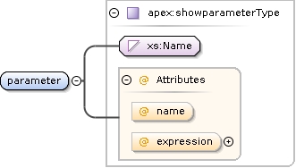
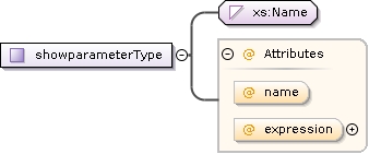
<xs:complexType name="showparameterType"><xs:simpleContent><xs:extension base="xs:Name"><xs:attribute name="name"><xs:annotation><xs:documentation>Parameter name to show in the list</xs:documentation></xs:annotation></xs:attribute><xs:attribute name="expression" type="apex:mathexpression"><xs:annotation><xs:documentation>Expression to be evaluated. Expressions must be in the format a*x+b, where x is the parameter value and a and b are floats</xs:documentation></xs:annotation></xs:attribute></xs:extension></xs:simpleContent></xs:complexType>
<xs:simpleType name="mathexpression"><xs:annotation><xs:documentation>Simple math expression of the format a*x+b</xs:documentation></xs:annotation><xs:restriction base="xs:string"><xs:pattern value="(\-?\d*\.?\d*)\s*\*\s*x\s*([+-])\s*(\d+\.?\d*)"/></xs:restriction></xs:simpleType>
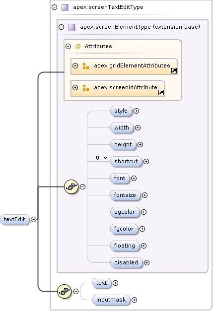
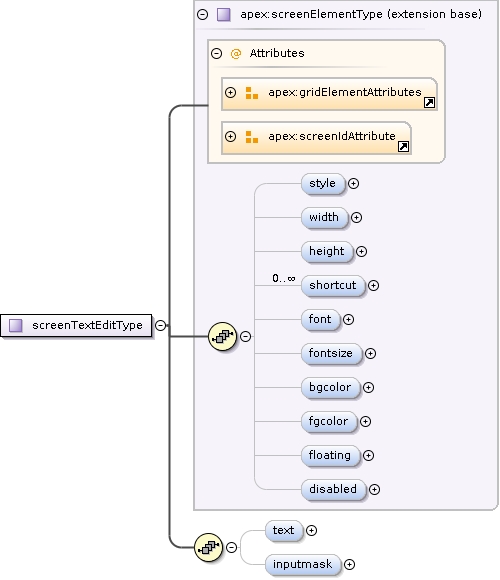
<xs:complexType name="screenTextEditType"><xs:annotation><xs:documentation>Text box to be filled in by the user</xs:documentation></xs:annotation><xs:complexContent><xs:extension base="apex:screenElementType"><xs:sequence><xs:element name="text" type="xs:string" minOccurs="0" maxOccurs="1"/><xs:element name="inputmask" type="xs:string" minOccurs="0" maxOccurs="1"><xs:annotation><xs:documentation>Input mask to restrict what can be typed in the textbox. Defined in the Qt documentation. If inputmask=="numbers", only numeric input will be allowed. If inputmask starts with a / (slash), the remainder will be used as a regular expression for QRegExpValidator.</xs:documentation></xs:annotation></xs:element></xs:sequence></xs:extension></xs:complexContent></xs:complexType>
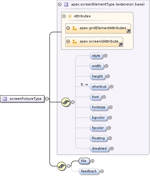
<xs:complexType name="screenPictureType"><xs:annotation><xs:documentation>Picture to be put on the screen.</xs:documentation></xs:annotation><xs:complexContent><xs:extension base="apex:screenElementType"><xs:sequence><xs:element name="file"><xs:annotation><xs:documentation>Filename of the picture. The format can be any of: PNG, BMP, XBM, XPM, JPEG, MNG, GIF, PBM (P1 or P4), PGM (P2 or P5), and PPM (P3 or P6). If path is relative, it will be prefixed with the prefix given above.</xs:documentation></xs:annotation><xs:complexType><xs:simpleContent><xs:extension base="xs:string"><xs:attribute name="id" type="xs:ID"/></xs:extension></xs:simpleContent></xs:complexType></xs:element><xs:element name="feedback" type="apex:feedbackPathsType" minOccurs="0" maxOccurs="1"><xs:annotation><xs:documentation>If used, overrides the normal feedback (using coloured borders) by drawing a different picture on screen.</xs:documentation></xs:annotation></xs:element></xs:sequence></xs:extension></xs:complexContent></xs:complexType>
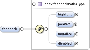
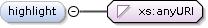
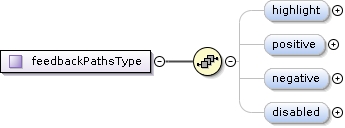
A screen element able to display different media depending on the state uses this to define the media.The paths are absolute or relative, eventually prefixed by the prefix.highlight = shown during stimulus play when 'showcurrent' is true.positive = shown as positive feedback when feedback is true.negative = shown as negative feedback when feedback is true.
<xs:complexType name="feedbackPathsType"><xs:annotation><xs:documentation>A screen element able to display different media depending on the state uses this to define the media. The paths are absolute or relative, eventually prefixed by the prefix. highlight = shown during stimulus play when 'showcurrent' is true. positive = shown as positive feedback when feedback is true. negative = shown as negative feedback when feedback is true.</xs:documentation></xs:annotation><xs:sequence><xs:element name="highlight" type="xs:anyURI" minOccurs="0"/><xs:element name="positive" type="xs:anyURI" minOccurs="0"/><xs:element name="negative" type="xs:anyURI" minOccurs="0"/><xs:element name="disabled" type="xs:anyURI" minOccurs="0"/></xs:sequence></xs:complexType>
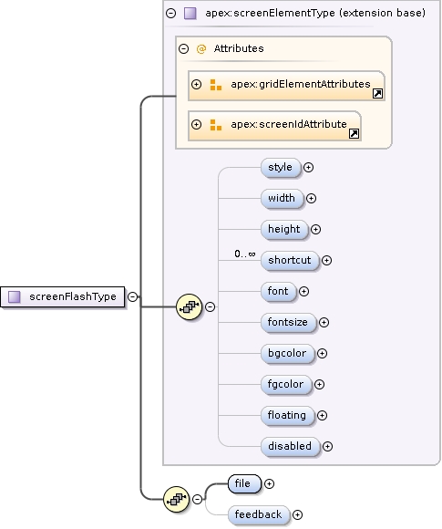
<xs:complexType name="screenFlashType"><xs:complexContent><xs:extension base="apex:screenElementType"><xs:sequence><xs:element name="file" type="xs:string"><xs:annotation><xs:documentation>Flash movie to be put on the screen.</xs:documentation></xs:annotation></xs:element><xs:element name="feedback" type="apex:feedbackPathsType" minOccurs="0" maxOccurs="1"><xs:annotation><xs:documentation>If used, overrides the normal feedback (using coloured borders) by putting a different movie on screen.</xs:documentation></xs:annotation></xs:element></xs:sequence></xs:extension></xs:complexContent></xs:complexType>
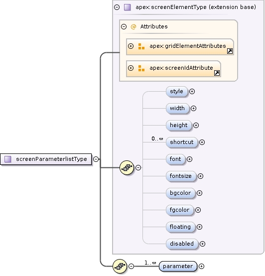
<xs:complexType name="screenParameterlistType"><xs:annotation><xs:documentation>A parameterlist shows the current value of several parameters (fixed or variable)</xs:documentation></xs:annotation><xs:complexContent><xs:extension base="apex:screenElementType"><xs:sequence><xs:element name="parameter" type="apex:showparameterType" maxOccurs="unbounded"/></xs:sequence></xs:extension></xs:complexContent></xs:complexType>
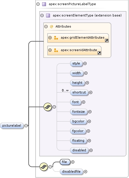
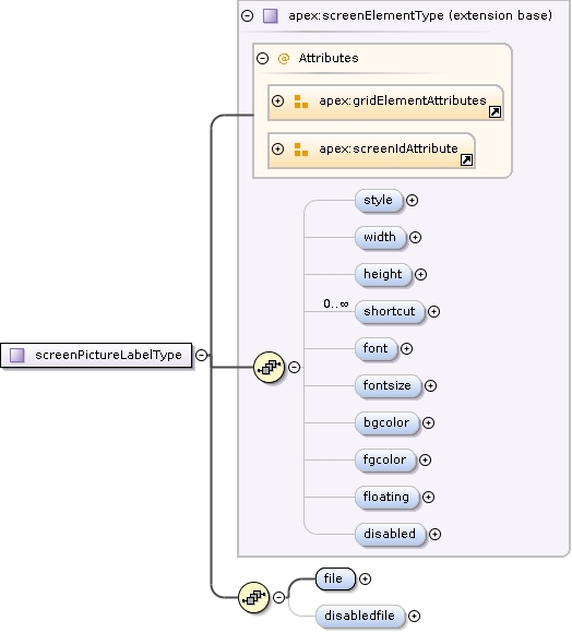
<xs:complexType name="screenPictureLabelType"><xs:annotation><xs:documentation>Label element with a picture on it. Cannot be used for user input.</xs:documentation></xs:annotation><xs:complexContent><xs:extension base="apex:screenElementType"><xs:sequence><xs:element name="file" type="xs:anyURI"><xs:annotation><xs:documentation>Filename of the picture. The format can be any of: PNG, BMP, XBM, XPM, JPEG, MNG, GIF, PBM (P1 or P4), PGM (P2 or P5), and PPM (P3 or P6). If path is relative, it will be prefixed with the prefix given above.</xs:documentation></xs:annotation></xs:element><xs:element name="disabledfile" type="xs:string" minOccurs="0"><xs:annotation><xs:documentation>Picture to be used if the element is disabled</xs:documentation></xs:annotation></xs:element></xs:sequence></xs:extension></xs:complexContent></xs:complexType>
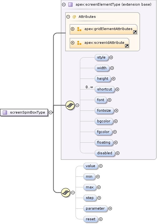
<xs:complexType name="screenSpinBoxType"><xs:annotation><xs:documentation>Spin box. Can set a parameter.</xs:documentation></xs:annotation><xs:complexContent><xs:extension base="apex:screenElementType"><xs:sequence><xs:element name="value" type="xs:integer" minOccurs="0"><xs:annotation><xs:documentation>Default value</xs:documentation></xs:annotation></xs:element><xs:element name="min" type="xs:integer" minOccurs="0"><xs:annotation><xs:documentation>Minimum value</xs:documentation></xs:annotation></xs:element><xs:element name="max" type="xs:integer" minOccurs="0"><xs:annotation><xs:documentation>Maximum value</xs:documentation></xs:annotation></xs:element><xs:element name="step" type="xs:integer" minOccurs="0"><xs:annotation><xs:documentation>Stepsize</xs:documentation></xs:annotation></xs:element><xs:element name="parameter" type="xs:IDREF" minOccurs="0"><xs:annotation><xs:documentation>Parameter to be set to the value of the spinbox. This parameter will be set the NEXT trial.</xs:documentation></xs:annotation></xs:element><xs:element name="reset" type="xs:boolean" default="false" minOccurs="0"><xs:annotation><xs:documentation>Reset the value for every new trial</xs:documentation></xs:annotation></xs:element></xs:sequence></xs:extension></xs:complexContent></xs:complexType>
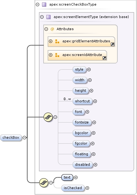
<xs:complexType name="screenCheckBoxType"><xs:annotation><xs:documentation>CheckBox element. Can be checked. If checkbox is clicked, the subject is assumed to have responded to the trial.</xs:documentation></xs:annotation><xs:complexContent><xs:extension base="apex:screenElementType"><xs:sequence><xs:element name="text" type="xs:string"><xs:annotation><xs:documentation>Text to be printed right to the checkbox</xs:documentation></xs:annotation></xs:element><xs:element name="isChecked" type="xs:integer" minOccurs="0"><xs:annotation><xs:documentation>Determines whether checkbox is checked by default</xs:documentation></xs:annotation></xs:element></xs:sequence></xs:extension></xs:complexContent></xs:complexType>
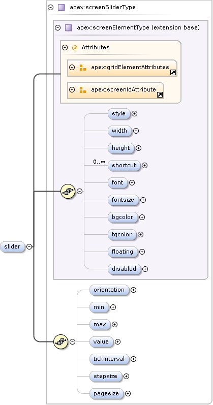
<xs:complexType name="screenSliderType"><xs:annotation><xs:documentation>Slider element.</xs:documentation></xs:annotation><xs:complexContent><xs:extension base="apex:screenElementType"><xs:sequence><xs:element name="orientation" minOccurs="0"><xs:annotation><xs:documentation>Orientation of slider</xs:documentation></xs:annotation><xs:simpleType><xs:restriction base="xs:string"><xs:enumeration value="horizontal"/><xs:enumeration value="vertical"/></xs:restriction></xs:simpleType></xs:element><xs:element name="min" type="xs:integer" minOccurs="0"><xs:annotation><xs:documentation>Minimum value of slider</xs:documentation></xs:annotation></xs:element><xs:element name="max" type="xs:integer" minOccurs="0"><xs:annotation><xs:documentation>Maximum value of slider</xs:documentation></xs:annotation></xs:element><xs:element name="value" type="xs:integer" minOccurs="0"><xs:annotation><xs:documentation>Default value of slider</xs:documentation></xs:annotation></xs:element><xs:element name="tickinterval" type="xs:integer" minOccurs="0"><xs:annotation><xs:documentation>Interval between slider ticks</xs:documentation></xs:annotation></xs:element><xs:element name="stepsize" type="xs:integer" minOccurs="0"><xs:annotation><xs:documentation>Step size on single arrow key press</xs:documentation></xs:annotation></xs:element><xs:element name="pagesize" type="xs:integer" minOccurs="0"><xs:annotation><xs:documentation>Step size of pageUp pageDown key press</xs:documentation></xs:annotation></xs:element></xs:sequence></xs:extension></xs:complexContent></xs:complexType>
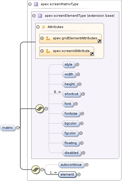
<xs:complexType name="screenMatrixType"><xs:annotation><xs:documentation>Matrix of buttons of which one in each column can be selected.</xs:documentation></xs:annotation><xs:complexContent><xs:extension base="apex:screenElementType"><xs:sequence><xs:element name="autocontinue" type="xs:boolean" default="true" minOccurs="0"><xs:annotation><xs:documentation>Automatically end the trial when all columns are completed</xs:documentation></xs:annotation></xs:element><xs:element name="element" minOccurs="1" maxOccurs="unbounded"><xs:complexType><xs:sequence><xs:element name="name" type="xs:string"><xs:annotation><xs:documentation>Name of the element. Will be reported in the results. Will also be used as text if no text is given.</xs:documentation></xs:annotation></xs:element><xs:element name="text" type="xs:string" minOccurs="0"><xs:annotation><xs:documentation>Text to be shown on the button</xs:documentation></xs:annotation></xs:element></xs:sequence><xs:attribute name="row" type="xs:positiveInteger" use="required"><xs:annotation><xs:documentation>Row in the matrix</xs:documentation></xs:annotation></xs:attribute><xs:attribute name="col" type="xs:positiveInteger" use="required"><xs:annotation><xs:documentation>Column in the matrix</xs:documentation></xs:annotation></xs:attribute></xs:complexType></xs:element></xs:sequence></xs:extension></xs:complexContent></xs:complexType>
<xs:complexType name="screenHtmlType"><xs:annotation><xs:documentation>Show HTML document</xs:documentation></xs:annotation><xs:complexContent><xs:extension base="apex:screenElementType"><xs:sequence><xs:element name="page" type="xs:anyURI"><xs:annotation><xs:documentation>Filename of the HTML document.</xs:documentation></xs:annotation></xs:element></xs:sequence></xs:extension></xs:complexContent></xs:complexType>
Stretch factor for the columns: a list of integers separated by comma's. If specified, there should be as much
integers as columns. The width of the columns will be proportional to the numbers. E.g. if width=2 and columnstretch="1,2", the
second column will be twice as wide as the first. columnstretch="2,4" would have the same effect.
Stretch factor for the rows: a list of integers separated by comma's. If specified, there should be as much
integers as rows. The width of the rows will be proportional to the numbers. E.g. if height=3 and rowstretch="1,2,1", the
second row will be twice as wide as the first and thirs. rowstretch="2,4,2" would have the same effect.
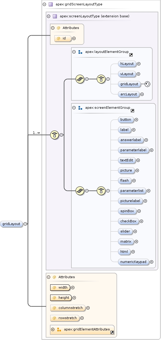
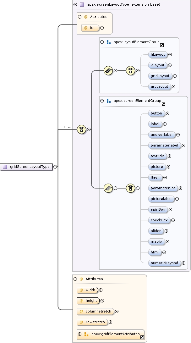
<xs:complexType name="gridScreenLayoutType"><xs:annotation><xs:documentation>Gridlayout: places elements in an (irregular) grid.</xs:documentation></xs:annotation><xs:complexContent><xs:extension base="apex:screenLayoutType"><xs:attribute name="width" type="xs:int" use="required"></xs:attribute><xs:attribute name="height" type="xs:int" use="required"></xs:attribute><xs:attribute name="columnstretch" type="apex:stretchregexp" use="optional"><xs:annotation><xs:documentation>Stretch factor for the columns: a list of integers separated by comma's. If specified, there should be as much integers as columns. The width of the columns will be proportional to the numbers. E.g. if width=2 and columnstretch="1,2", the second column will be twice as wide as the first. columnstretch="2,4" would have the same effect.</xs:documentation></xs:annotation></xs:attribute><xs:attribute name="rowstretch" type="apex:stretchregexp" use="optional"><xs:annotation><xs:documentation>Stretch factor for the rows: a list of integers separated by comma's. If specified, there should be as much integers as rows. The width of the rows will be proportional to the numbers. E.g. if height=3 and rowstretch="1,2,1", the second row will be twice as wide as the first and thirs. rowstretch="2,4,2" would have the same effect.</xs:documentation></xs:annotation></xs:attribute><!--xs:attribute name="id" type="xs:ID" use="optional"> </xs:attribute--><xs:attributeGroup ref="apex:gridElementAttributes"/></xs:extension></xs:complexContent></xs:complexType>
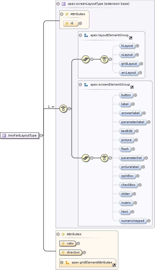
TwoPartLayout: divides the screen in two parts with a proportion given by the ratio parameter.The position of the child elements is determined by the y coördinate.
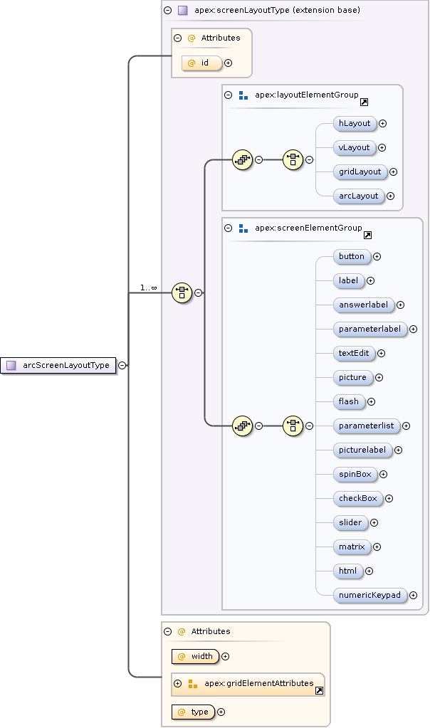
<xs:complexType name="twoPartLayoutType"><xs:annotation><xs:documentation>TwoPartLayout: divides the screen in two parts with a proportion given by the ratio parameter. The position of the child elements is determined by the y coördinate.</xs:documentation></xs:annotation><xs:complexContent><xs:extension base="apex:screenLayoutType"><xs:attribute name="ratio" type="xs:float" use="required"></xs:attribute><xs:attribute name="direction" type="apex:horivertType" use="required"></xs:attribute><xs:attributeGroup ref="apex:gridElementAttributes"/></xs:extension></xs:complexContent></xs:complexType>
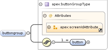
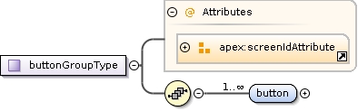
<xs:complexType name="buttonGroupType"><xs:annotation><xs:documentation>Buttons can be grouped together using a buttongroup to form a single answer element.</xs:documentation></xs:annotation><xs:sequence><xs:element name="button" minOccurs="1" maxOccurs="unbounded"><xs:complexType><!--xs:attribute name="id" type="xs:IDREF" use="required"/--><xs:attribute name="id" type="xs:Name" use="required"/><!-- FIXME --></xs:complexType></xs:element></xs:sequence><!--xs:attribute name="id" type="xs:ID"/--><xs:attributeGroup ref="apex:screenIdAttribute"/></xs:complexType>
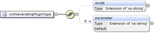
<xs:complexType name="xmlGeneratingPluginType"><xs:sequence><xs:element name="script" minOccurs="0"><xs:complexType><xs:simpleContent><xs:extension base="xs:string"><xs:attribute name="source" use="required"><xs:simpleType><xs:annotation><xs:documentation>If inline, the ECMAScript function must be defined inside this element, if file, the filename must be given</xs:documentation></xs:annotation><xs:restriction base="xs:string"><xs:enumeration value="inline"/><xs:enumeration value="file"/></xs:restriction></xs:simpleType></xs:attribute></xs:extension></xs:simpleContent></xs:complexType></xs:element><xs:element name="parameter" default="" minOccurs="0" maxOccurs="unbounded"><xs:complexType><xs:simpleContent><xs:extension base="xs:string"><xs:attribute name="name" type="xs:Name" use="required"/></xs:extension></xs:simpleContent></xs:complexType></xs:element></xs:sequence><!--xs:attribute name="id" type="xs:ID" use="required"/--></xs:complexType>
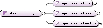
<xs:simpleType name="shortcutRegExp"><xs:restriction base="xs:string"><!--xs:pattern value="Key_[A-Z0-9]"> </xs:pattern--><xs:pattern value="."/><!--Any Character is ok--><xs:length value="1"/></xs:restriction></xs:simpleType>
<xs:attribute name="source" default="inline"><xs:simpleType><xs:restriction base="xs:string"><xs:enumeration value="inline"><xs:annotation><xs:documentation>The prefix will be specified in this element</xs:documentation></xs:annotation></xs:enumeration><xs:enumeration value="apexconfig"><xs:annotation><xs:documentation>The prefix will be loaded from the apexconfig.xml file</xs:documentation></xs:annotation></xs:enumeration></xs:restriction></xs:simpleType></xs:attribute>
<xs:attribute name="length" type="xs:positiveInteger"><xs:annotation><xs:documentation>The period to show the screen</xs:documentation></xs:annotation></xs:attribute>
<xs:attribute name="length" type="xs:nonNegativeInteger" default="1000"><xs:annotation><xs:documentation>Length of the feedback in ms. If feedback is false but a length is present, the specified time will be the time between two trials.</xs:documentation></xs:annotation></xs:attribute>
<xs:attribute name="name" type="xs:string" use="required"><xs:annotation><xs:documentation>Name of the plugin to be loaded</xs:documentation></xs:annotation></xs:attribute>
<xs:attribute name="length" type="xs:nonNegativeInteger"><xs:annotation><xs:documentation>Length of the movie in ms, if not specified, the system will wait for the movie to end and then continue.</xs:documentation></xs:annotation></xs:attribute>
<xs:attribute name="length" type="xs:nonNegativeInteger"><xs:annotation><xs:documentation>Length of the movie in ms</xs:documentation></xs:annotation></xs:attribute>
<xs:attribute name="action" use="optional" default="click"><xs:simpleType><xs:restriction base="xs:string"><xs:enumeration value="click"><xs:annotation><xs:documentation>Has the same effect as clicking the widget</xs:documentation></xs:annotation></xs:enumeration><xs:enumeration value="up"><xs:annotation><xs:documentation>Has the same effect as clicking the up-button</xs:documentation></xs:annotation></xs:enumeration><xs:enumeration value="down"><xs:annotation><xs:documentation>Has the same effect as clicking the up-button</xs:documentation></xs:annotation></xs:enumeration></xs:restriction></xs:simpleType></xs:attribute>
<xs:attribute name="modifier"><xs:annotation><xs:documentation>Dead key to be used together with the shortcut</xs:documentation></xs:annotation><xs:simpleType><xs:restriction base="xs:string"><xs:enumeration value="Ctrl"/><xs:enumeration value="Alt"/><xs:enumeration value="Shift"/></xs:restriction></xs:simpleType></xs:attribute>
<xs:attribute name="hex" type="xs:boolean"><xs:annotation><xs:documentation>If true, parses the shortcut as a hexadecimal number. See the Key enum in qtnamespace.h for known values</xs:documentation></xs:annotation></xs:attribute>
<xs:attribute name="row" type="xs:int"><xs:annotation><xs:documentation>Row in the grid. Is the same as y, but should not be used together with y</xs:documentation></xs:annotation></xs:attribute>
<xs:attribute name="col" type="xs:positiveInteger"><xs:annotation><xs:documentation>Column in the grid. Is the same as x, but should not be used together with x</xs:documentation></xs:annotation></xs:attribute>
<xs:attribute name="expression" type="apex:mathexpression"><xs:annotation><xs:documentation>Expression to be evaluated. Expressions must be in the format a*x+b, where x is the parameter value and a and b are floats</xs:documentation></xs:annotation></xs:attribute>
<xs:attribute name="row" type="xs:positiveInteger" use="required"><xs:annotation><xs:documentation>Row in the matrix</xs:documentation></xs:annotation></xs:attribute>
<xs:attribute name="col" type="xs:positiveInteger" use="required"><xs:annotation><xs:documentation>Column in the matrix</xs:documentation></xs:annotation></xs:attribute>
Stretch factor for the columns: a list of integers separated by comma's. If specified, there should be as much integers as columns. The width of the columns will be proportional to the numbers. E.g. if width=2 and columnstretch="1,2", the second column will be twice as wide as the first. columnstretch="2,4" would have the same effect.
<xs:attribute name="columnstretch" type="apex:stretchregexp" use="optional"><xs:annotation><xs:documentation>Stretch factor for the columns: a list of integers separated by comma's. If specified, there should be as much integers as columns. The width of the columns will be proportional to the numbers. E.g. if width=2 and columnstretch="1,2", the second column will be twice as wide as the first. columnstretch="2,4" would have the same effect.</xs:documentation></xs:annotation></xs:attribute>
Stretch factor for the rows: a list of integers separated by comma's. If specified, there should be as much integers as rows. The width of the rows will be proportional to the numbers. E.g. if height=3 and rowstretch="1,2,1", the second row will be twice as wide as the first and thirs. rowstretch="2,4,2" would have the same effect.
<xs:attribute name="rowstretch" type="apex:stretchregexp" use="optional"><xs:annotation><xs:documentation>Stretch factor for the rows: a list of integers separated by comma's. If specified, there should be as much integers as rows. The width of the rows will be proportional to the numbers. E.g. if height=3 and rowstretch="1,2,1", the second row will be twice as wide as the first and thirs. rowstretch="2,4,2" would have the same effect.</xs:documentation></xs:annotation></xs:attribute>
<xs:attribute name="description" type="xs:string" use="optional"><xs:annotation><xs:documentation>Description of the screen - for your own reference</xs:documentation></xs:annotation></xs:attribute>
<xs:attribute name="source" use="required"><xs:simpleType><xs:annotation><xs:documentation>If inline, the ECMAScript function must be defined inside this element, if file, the filename must be given</xs:documentation></xs:annotation><xs:restriction base="xs:string"><xs:enumeration value="inline"/><xs:enumeration value="file"/></xs:restriction></xs:simpleType></xs:attribute>
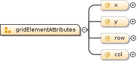
<xs:attributeGroup name="gridElementAttributes"><xs:attribute name="x" type="xs:int"/><xs:attribute name="y" type="xs:positiveInteger"/><xs:attribute name="row" type="xs:int"><xs:annotation><xs:documentation>Row in the grid. Is the same as y, but should not be used together with y</xs:documentation></xs:annotation></xs:attribute><xs:attribute name="col" type="xs:positiveInteger"><xs:annotation><xs:documentation>Column in the grid. Is the same as x, but should not be used together with x</xs:documentation></xs:annotation></xs:attribute></xs:attributeGroup>